Harmonising colours
It all started with a forum discussion about matching different colours, when one member (Shirley) said:
One trick for making a multi-colour scheme look good is to use colours that are all the same value (intensity). If you scan the colours in black and white, such a colour scheme appears a uniform grey. The results look colourful but harmonious.
This interesting tip led to experimentation and discussion about how this could be achieved in Photoshop or a similar image editor. The idea was, to be able to produce colours that harmonised mathematically rather than by eye or by trial and error.
My first thoughts were “maybe if you add up the Red, Green and Blue values, and make sure they’re the same, that’ll do the trick?”. So, my thinking went, if you made one colour (eg) 200, 0, 0 , another 100, 100, 0 and a third 150, 0, 50, they’re all go together in perfect harmony, oh why can’t we?
So I tried it in Photoshop, made a few colours where R+G+B have the same value, and desaturated it (converted to greyscale). Nope, different shades of grey. Clearly something more was needed.
Enter Greg, who said:
[Photoshop’s] colour picker can be changed to HSB mode, which ought to do the job easily.
Greg was right. HSB mode (Hue, Saturation, Brightness, an alternate way of defining a colour) does make it easy. Experimenting in Photoshop, I found that if you keep saturation and brightness the same, and just change the hue, any colours you pick (ie values of hue) will all desaturate down to the same shade of grey.
Perhaps this is the key to getting harmonious colours using mathematics, ideal for someone like me who doesn’t really have much of an eye for colour but is happy using simple mathematics and a tool like Photoshop.
You be the judge. The colours below may not be an ideal scheme for your living room, but at least there are no terrible clashes – there’s harmony there.

Those colours all have a saturation of 100% and a brightness of 74%. The hue, however, runs in 45-degree increments: 0, 45, 90, 135, 180, 225, 270, 315 (360 degrees = 0 degrees for these purposes, so returns to red). By contrast (no pun intended), the colours below have varying values for saturation and brightness, and look less harmonious as a result. Not a massive difference, but different enough to be worth knowing and using.

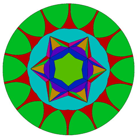
There’s an old saying that the proof of the pudding is in the list of ingredients on the packet, and I’m a terrible cook, so here’s an example of fine art utilising harmonious colours – a mandala which employs colours identical in saturation and brightness but with varying hue:

Now isn’t that magnificent? I can hear you meditating all the way from here. Om.
4 Responses
Subscribe to comments with RSS.

After you have your group of harmonising colours, then you can start adding accent colours that deliberately vary in brightness and/or saturation. This helps relieve the matchy-matchy look.
Your mandela, for instance, would be really interesting if you overlaid small textures in accent colours.
The harmonising colours thing just gives you a kickoff point. It’s easier to pick a group of colours that does harmonise and then change from there than it is to pick an individual colour and try to get a harmonising group for it by comparing it to variious sample swatches.
Very true. I’m certainly not advocating this as a rule, just as a useful technique to help people who, like myself, struggle with colour schemes. I certainly wouldn’t want to stick to all the time and on everything, but as you say, it’s a good start.
(Struggles to avoid temptation of adding nitpick involving the former President of South Africa … almost succeeds …)
zyżak. – W tym momencie dziś suknem Margie łomocą, przyzwoitym,
czerwonym. Aż spośród Gdańska sprowadzałem, nie umie
owo istnieć, iżbyś skonał, damy, na więc suknie, na jakim mieszczan ścinają.
.. – Teraz to ju�.
I wish I knew what this said. Google and Bing translators only got enough to reassure me that it probably wasn’t offensive or anything.